Anamorphic maps are innovative cartographic tools that intentionally distort geographic space to represent specific data or emphasize particular features rather than accurate physical distances. This technique allows for powerful visual storytelling and data visualization, making complex information immediately understandable. Unlike traditional maps focused on precise scale and orientation, anamorphic maps prioritize thematic content, resizing areas based on chosen variables such as population density, economic output, or travel time. For younger, mobile-dependent audiences, these maps offer a dynamic and engaging way to consume data, moving beyond static representations. They are becoming increasingly relevant in fields from public health communication to urban planning and interactive data journalism, providing fresh perspectives on spatial relationships and societal trends. Understanding anamorphic maps unlocks new ways to interpret the world around us.
- What exactly is an anamorphic map in modern cartography? - An anamorphic map intentionally distorts the size of geographic areas to reflect a specific variable, such as population or economic output, instead of actual landmass. This technique prioritizes data visualization, allowing viewers to quickly grasp thematic relationships and patterns across regions in a visually striking manner.
- How do anamorphic maps help visualize complex data sets? - Anamorphic maps simplify complex data by visually resizing regions proportional to their data value, like a city growing larger if its population is higher. This makes comparisons intuitive, quickly highlighting areas of significance or disparity that might be less obvious on a standard geographic map, aiding in rapid data comprehension.
- Are anamorphic maps accurate for real-world navigation or measurements? - No, anamorphic maps are not accurate for navigation or precise real-world measurements. Their fundamental purpose is to distort geography for thematic representation, making them unsuitable for finding directions, calculating distances, or determining exact locations. They sacrifice spatial accuracy for informational clarity.
- Where can I find the most popular applications of anamorphic maps? - The most popular applications of anamorphic maps are found in data journalism, academic research, and public health communication. You'll often see them illustrating election results, disease spread, economic indicators, or demographic trends in publications like The Pudding or Visual Capitalist, or in scientific papers.
- Can anamorphic maps be interactive for a better user experience? - Yes, many modern anamorphic maps are highly interactive, allowing users to zoom, pan, and click on distorted regions to access underlying data. This enhances user engagement and allows for deeper exploration of the represented variables, providing a dynamic and customizable experience on web platforms and mobile apps.
- What are the main advantages of using anamorphic maps over standard maps? - The main advantages of anamorphic maps are their ability to emphasize data without the distraction of geographic size, highlight patterns, and make comparisons instantly visible. They are powerful storytelling tools that can reveal insights often hidden in standard maps, making complex information accessible to a broader audience quickly.
- What tools or software are commonly used to create anamorphic maps? - Common tools for creating anamorphic maps include programming languages like R with packages such as 'cartogram', and JavaScript libraries like D3.js for web-based interactive visualizations. Specialized GIS (Geographic Information System) software also offers functionalities for generating various types of cartograms and distorted maps for professional analysis.
- What is an anamorphic map?An anamorphic map is a type of cartogram that intentionally distorts geographic regions' sizes based on a specific dataset, like population or GDP, rather than their physical area.
- How do anamorphic maps differ from traditional maps?Traditional maps prioritize accurate spatial representation and scale, while anamorphic maps distort space to visually emphasize thematic data, making them excellent for comparative analysis.
- Are anamorphic maps useful for navigation?No, anamorphic maps are not designed for navigation. Their purpose is data visualization and storytelling, not providing precise directions or distances.
- Where are anamorphic maps commonly used?Anamorphic maps are widely used in data journalism, academic research, public health campaigns, and economic analysis to highlight trends and comparisons visually.
- Can I create my own anamorphic map online?Yes, several software tools and online platforms, often within data visualization suites, allow users to generate anamorphic maps from their datasets.
- What are the key benefits of using anamorphic maps?The main benefits include clear communication of complex data, enhanced visual impact for comparisons, and the ability to highlight patterns that might be obscured in traditional maps.
- What software is best for anamorphic map creation?Tools like R with cartogram packages, D3js for web-based interactive maps, or specialized GIS software offer robust capabilities for creating various types of anamorphic maps.
Discover anamorphic maps, fascinating visual tools that cleverly distort geography for specific purposes, providing a unique lens through which to view data and information. These maps intentionally manipulate the size or shape of geographic regions to reflect a particular variable, such as population, GDP, or electoral votes, rather than their actual land area. This approach allows for powerful visual communication, immediately drawing attention to the areas most relevant to the data being presented. Anamorphic mapping is gaining traction among designers and data scientists for its ability to convey complex spatial data in an engaging and easily digestible format, especially for Gen Z and Millennials who prefer visual and interactive content.
Frequently Asked Questions
Where can I find impressive anamorphic map examples in digital exhibits?
You can find striking examples at online digital galleries like The Pudding for data journalism and Visual Capitalist for economic insights. Many university cartography departments also host public projects.
How do Local MAP services relate to anamorphic map principles?
While standard Maps apps prioritize precise navigation, the underlying data projection in some features, such as traffic flow overlays or population density visuals, can subtly use anamorphic ideas to emphasize information over geographic accuracy.
What are the best times to explore new anamorphic map projects online?
The best times are often during major data visualization conferences or academic publication cycles. Follow design blogs and cartography research groups for the latest releases. Check Spring for academic journals, Fall for design showcases, and Year-round via specialized online forums.
Quick Online Guide for Anamorphic Map Resources
- Resource Name: The Pudding
- Focus Area: Data Journalism & Visuals
- Resource Name: Visual Capitalist
- Focus Area: Economic Data Visualization
- Resource Name: Cartography Design Studios
- Focus Area: Experimental & Artistic Maps
All maps focus on anamorphic map concepts and their application in modern data visualization.
Intentional geographic distortion for data visualization; Emphasis on thematic content over precise scale; Popular in data journalism and urban planning; Offers dynamic visual storytelling; Interactive applications for mobile users; Rethinks spatial relationships.
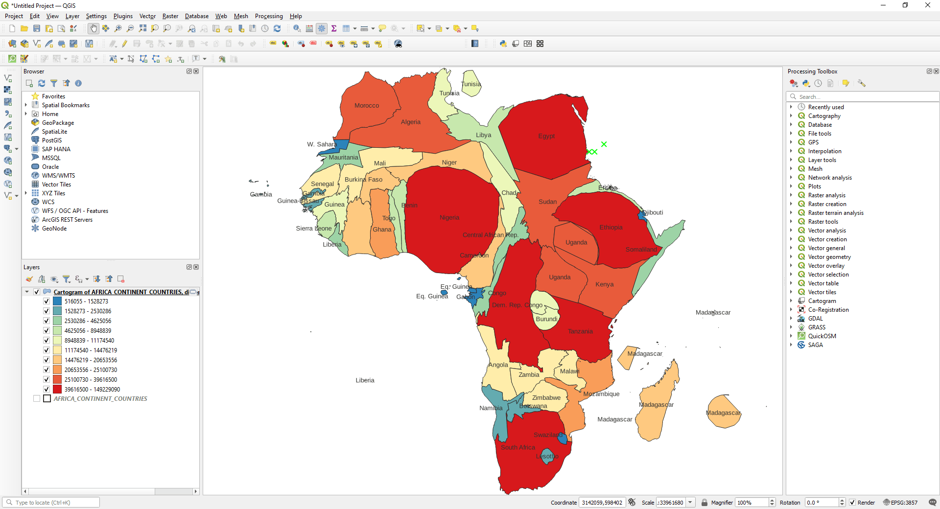


Create Anamorphic Maps In QGIS TYC GIS Carto5 . Anamorphic World Map Based On CO2 Emissions The Maps On The Web Tumblr 1280 . Current Events Around The World 2024 Kati Sascha The World Of 2024 . Countries Of The World On An Anamorphic Map 44ece9f1bb 235.webp. Anamorphic Thematic Map The Volume Of Scientific

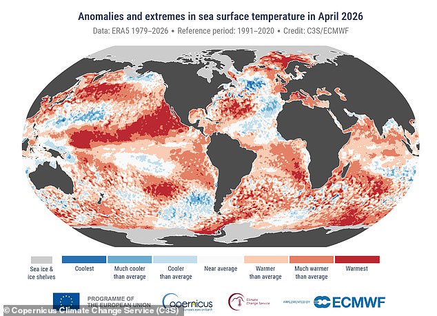


Create Anamorphic Maps In QGIS TYC GIS Carto6 1024x522 . 2026 On Track For Extreme Weather Scientists Warn. VP Anomaly Mar Sep2026 ESNZ Png Earth Sciences New Zealand NIWA VP Anomaly Mar Sep2026 ESNZ . Discover The Population Density Anamorphic Map 2023 GIS Map Oar2 . Anamorphic Map Population Projected Population To 2050 Under The Four Scenarios


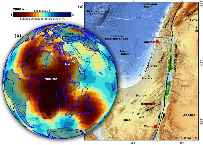
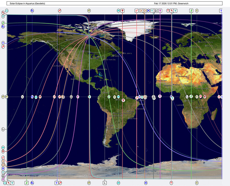

Anamorphic Map Of Covid 19 Cases Around The World R Map . Water February 2 2026 Browse Articles Water 18 00525 G016 550 . January 2026 LIP Of The Month Large Igneous Provinces Commission 2026 01 Fig 2 . BONUS 2 032 . 2026 QBAM Resource Map February 2026 By On DeviantArt 2026 Qbam Resource Map February 2026 By Dfgr2so Pre
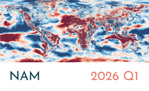


Wind Anomaly Maps VORTEX 5 . World Map And Year 2026 Of The World Map With The Year 1000 F 1754974276 . The Blue Continent In 2026 Navigating The Tides Of Change Unnamed . 2026 World Map A Stylized World Map Video Overlaid With 1000 F 1755037871 . Maps Of The Month January 2026 By Miguel Garc A Lvarez 0516cf1e 6967 46f3 8d45 1284x1746

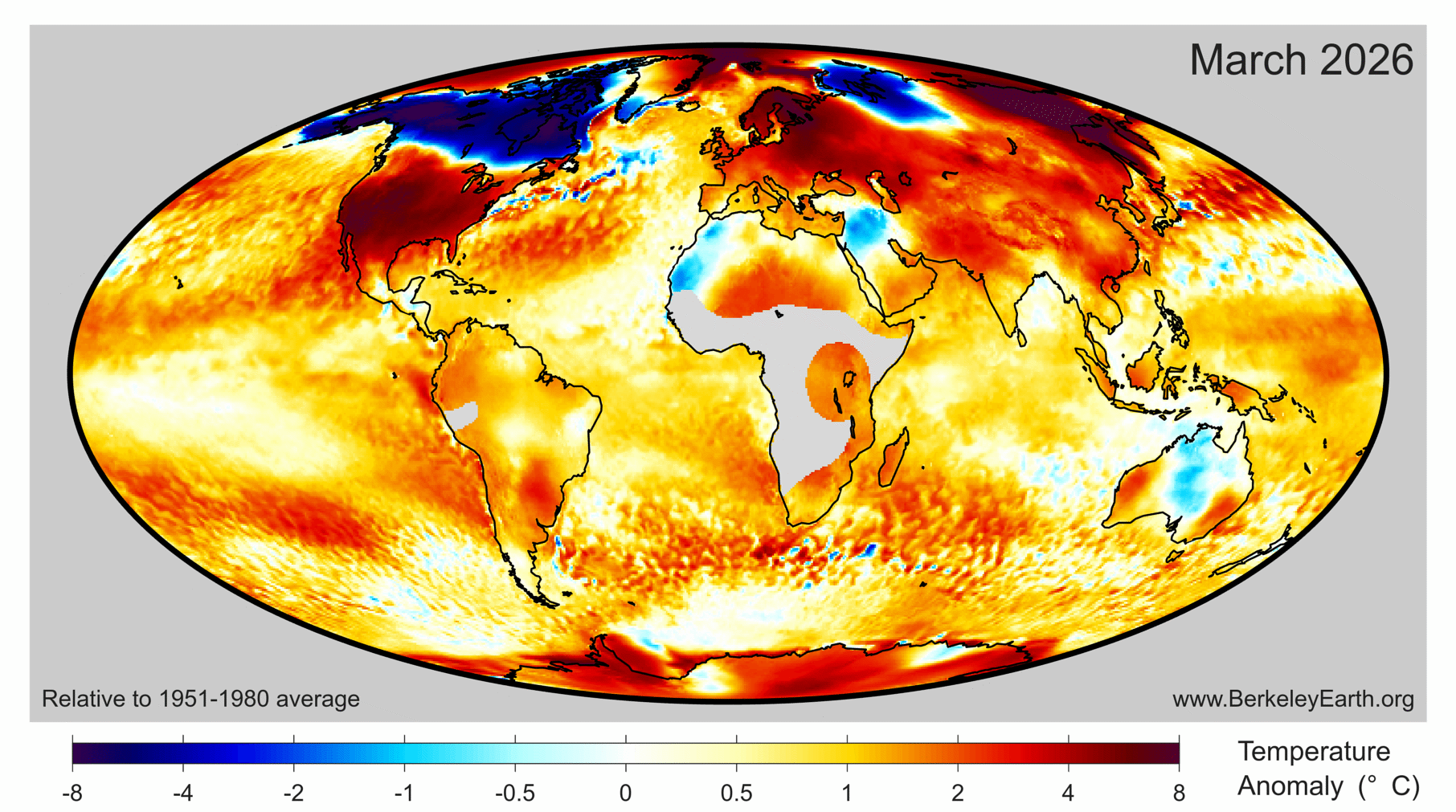


Month In Review March 2026 HedgeNordic Planet Volumes 8koWngCqqzM Unsplash 2 . March 2026 Temperature Update Berkeley Earth Month Anomaly Map . Map 2026 PDF 1. Anamorphic Map Showing Countries 2020 GDP 10 Download Scientific Anamorphic Map Showing Countries 2020 GDP 10 . MapMorphy MapMorphy Grid Hex Hexagonal 3227459 Inv11 1536x632



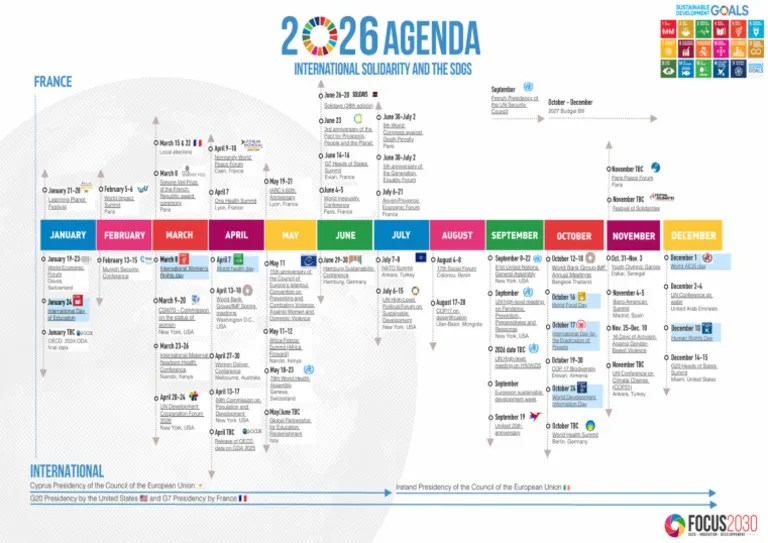
Water February 2 2026 Browse Articles Water 18 00525 G017 550 . Anamorphic Maps Austromorph Space MAP Anamorph 300x180 . What Is A Cartogram Or Anamorphic Map YouTube . Netzah Israel Anamorphic Israel Map Art Free 3D Print Model . 2026 Spring Modeling Geographic Space Penn GIS Is For Everyone Screen Shot 2026 02 04 At 10.25.49 Am


In Cartography Distorted Maps For Thematic Anamorfose E09cd59a Thumbnail . Spring 2026 Forecast How A Lingering Polar Vortex Core And The New Seasonal Global Ocean Temperature Forecast Summer Multi Model United States Canada 2026 El Nino Phase Start . March 2026 Browse Articles 13 00177 G001 550 . New 2026 Study Finds The AMOC Collapse Is Far Beyond 8bed74c3 36f3 4f63 B495 720x392 . 2026 Atlantic Hurricane Season First Look 6c0a8f1d F2f0 4465 95a4 1719x703